4 Reasons Why You Want a Responsive Website
A Responsive website is designed to be user-friendly on a laptop, a mobile phone, a tablet and whatever else you can think of, so if your site isn’t your audience (and you) are not going to be happy!
01
People Use Their Phones A Lot - Don’t Annoy Them!
Your site should stand out in a crowd. Don’t lose busy people from the get-go.
This is a pretty obvious point, but people use their phones a lot. There are countless studies about mobile phone usage but there’s a few statistics that really jump out.
American adults will spend, on average, over 3 1/2 hours on their phone every day and that number is expected to only increase.
Now consider that in 2018 mobile devices made up 58% of all website visits.
And perhaps most importantly, 60% of all Google Searches are from mobile devices. Don’t exclude a majority of your potential visitors!

02
Google Rewards Your Site
Play well with Google by creating mobile friendly websites.
Google will rank your site higher in it’s search results if it is responsively designed.
This is a big deal because if you and a competitor have exactly the same services offered, descriptions, key search terms and similar traffic numbers, the mobile-friendly site will be presented higher and is therefore more likely to be clicked on.
This goes back to 2015 when Google announced they would be preferentially treating responsive sites. The idea being that they would like to present the most relevant and helpful sites for their users. As Google dominates the web-search industry, it’s generally a good decision to play along with their guidelines.
Now the good news is you can update your site and Google will ‘recrawl’ your site and reward your updates with a better search ranking.
03
First Impressions Matter
Time is ticking once someone finds your site. Show them what you do immediately.
How long does a typical person stay on a website? 1 minute? Nope.
Usually someone sticks around on a single site for about 15 seconds. That doesn’t give you a lot of time to get your point across. That’s why your first impression is so important.
The ‘Bounce rate’ for most well-performing sites hovers around 60%. That means that 60% of your site’s visitors are leaving before checking any other page or section of your site. Studies show that there are different types of usage rates for Mobile visitors vs. Desktop visitors. You can probably apply this to yourself too.
Mobile users are more likely to be explorers and searchers – they are looking for things they want right now. People use their phones to find what they are looking for immediately – the location of your business, or a brief understanding of what your business does are things they will look for right now.
Desktop users are going to spend more time on your site (nearly twice as long, in fact). They are more likely to be researchers (learning what exactly you do), comparers (how do you stack up against your competition), and ultimately purchasers (let me buy something!).
Don’t forget the old adage: First Impressions Can Last Forever.

04
Mobile vs. Desktop Functionality
There are practical reasons why your site should be user-friendly on a mobile phone too.
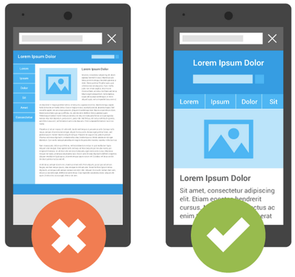
Maybe most obviously, there’s a lot less screen to look at when on your phone. Ensuring the layout of the page is clear is essential.
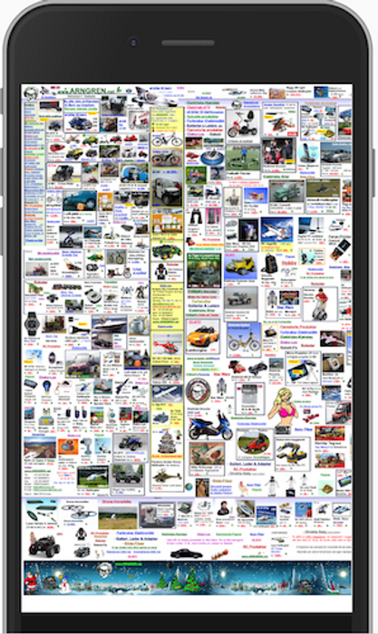
Good God! My eyes!
What Should You Do Now?
- Check it on your phone
You might be wondering if your site is working on people’s phones by now. Worry not – you don’t need to go crazy wondering.
The first thing you can try is just opening your site on your phone (duh!). If you work on your computer all the time, it might be surprising to you how your site looks on your phone (or tablet).
3. Make Some Updates